Yes, I know, I'm interesting in talking about what might otherwise be considered boring, or at least less then exciting, since all you've heard from me so far is talking about workspaces and how we use them, and now I want to talk about file browsers? Boooooring.
Although we are Ubuntu users, so maybe this isn't so boring. What I want to take a look at is not something that hasn't been looked at before, Ian Cylkowski took an extremely detailed look at Nautilus, and OMG! looked at his post as well. DanRabbit has taken a shot at simplifying things, and the result is Nautilus Elementary, a revision that has been received with many cries of OMG! Just like finder!
So me, being exactly what I am, decided to do a comparison of the 3 filebrowsers that I see the most, Windows Explorer, Nautilus-Elementary, and Finder, as well normal Nautilus.
First up, lets look at what all of these have in common.
Nautilus Elementary:

Windows 7:


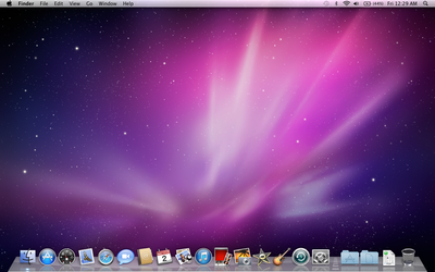
1 - Navigation
2 - Sidebar, with bookmarks, devices, networks devices, places, and or recent files
3 - View options
4 - Preferences and option menu
5 - Search (bar or button)
6 - Current folder information
7 - Zoom slider
8 - Location Heirarchy
9 - Content of folder
So, what do we see? Well, lets compare some things. First up is navigation controls. All of the different file browsers have a back arrow and a forward arrow, and some have more. Finder keeps it just at the two, Explorer adds a little drop arrow for recent locations and a reload button in the location bar, Nautilus-Elementary doesn't have the drop arrow but does have a reload icon next to the arrows, and... then theres standard nautilus. Back, Forward, (both with drop down menus) up, stop, reload, home, and computer. Yeesh.
#2? Sidebar. Explorer and Finder both have a tree-like navigation, at least to some degree, allowing the user to hide categories they aren't using. Finder organizes into Places, Explorer uses Libraries, and both have secondary drives, as does Nautilus. However, Nautilus, as default, does not have hidden options, but instead lists the home folder, desktop, file system, network, trash, all connected drives, and all bookmarks. Not inherently that different, as all 4 show devices and places of documents, just in slightly different ways.
3 is View controls. Nautilus and Explorer share a drop-down menu listing different view options, while Nautilus-Elementary and Finder have a set of buttons, 3 and 4 respectively. Interestingly, Explorer combines the zoom slider within its view control, different from the other 3.
4: Preferences. Nautilus has preferences for it hidden within the edit menu, a few clicks from the user. At the other end of the spectrum, explorer puts a whole lot of options out in the open. However, it too hides menu items behind a keystroke. Finder has a drop button, as well as options in the global menu. Lastly, Nautilus-Elementary hides the menu behind a menu button which then unhides the menu.
5. Search. Windows Explorer and Finder both have search bars on the upper right, while Nautilus and Nautilus-Elementary both have a search button to activate a search bar over the breadcrumb trail. (Yes, the screenshot of Nautilus-Elementary from my desktop is modded with a different breadcrumb trail, thanks to Gnaag).
6. Current Folder information. This lists how many items, and how much available space is in the current folder, while when a folder or program is highlighted, it shows the content size. All 4 basically do this the same, although windows explorer goes waaaaay more in depth with the available information.
7. Nautilus has a plus and minus set of buttons, while Nautilus-Elementary and Finder have a left-right slider in the bottom right. Explorer combines the zoom with the view options drop menu.
8. Where are you at? The breadcrumb trail shows you where you are in the hierarchy of folders. In Nautilus and Nautilus-Elementary both (keep in mind that mine is slightly modded), there is a clear heirarchy visible, which, when clicked, goes to the selected folder. Windows Explorer shows this heirarchy in plain text, much like a web browser. Lastly, Finder does this in sort of a hybrid spatial view, which slides over the previous folder when a new one is opened.
9. Your content! This is basically all the same, everywhere.
So? Well, we've looked at whats the same, and whats different. Overall, I think that in terms of use and features, Finder and Explorer are the most similar of the browsers, while Nautilus-Elementary and Finder have some of the most similar visual stylings of minimalism. I think that Nautilus-Elementary and Explorer has the most balance in its design, as you can see by where all the red ink on each, and the basic clean feel of the layout, even if Explorer is (upon closer inspection) the most complex in terms of most information in sight.
My conclusion? Theres still way to much going on in all of these designs. Nautilus is straight up a joke, with overlapping and repeated functionality, information all crammed to the left margin, and overall just a lot of clutter. Explorer has far more information, yet doesn't feel anything close to as crowded or overdone, mostly because it is actually really well designed. But really, do I need an open menu at all times? just double click, right? Do I need a print and burn option at all times? Theres so many buttons that neatly blend together and sit in good balance, but are simply not necessary. Yet Nautilus seems to have learned nothing from them.
Nautilus-Elementary is really a fantastic example of a nice clean interface, with a very nice balance. Especially considering the building base of Nautilus and its mess, this design has really done much to bring a new balance previously missing from the file browser, and to clear away many of the options we simply do not need. But is it a little to much of a Finder clone?
I personally don't think so. To me, it behaves the most like Explorer, in a good way. Its looks have only one thing in common with Finder: cleanliness. The rest is simply shared heritage of file browsers, working the way file browsers ought to. I'm a huge fan of bringing file browsers back to where they ought to be on my computer: connecting me to my documents quickly, and without getting in my way.
I gathered screenshots from:

Nice article, but you didn't mention anything about tabs. I think it's pretty interesting that the only file browser to natively support tabs is Nautilus. Even if it does a pretty terrible job about it.
ReplyDeleteThe new tab button is hidden in the edit menu which means that you're going to need two clicks just to open an additional tab; whereas you can refresh the page (significantly less useful IMO), with just one...
You even get a tab menu; you can navigate between tabs or reorder them. Which is all very nice but doesn't warrant a whole menu. The GUI does all that very well, and if they used the "normal" keyboard shortcuts, you wouldn't need the menu for reference as to those either.
Very good point! I forgot all about tabs. My primary goal was to look at the basics of the default set up, and it kinda slipped my mind that tabs do indeed come as default.
ReplyDeleteBut I agree with your assessment, both tabs and second panes are horribly implemented, as its basically impossible to get to them quickly, and is kinda clunky over all. Its always easier for me to just open a second window entirely.
What about Dolphin? =) What are your thoughts?
ReplyDeleteabout the point #1 on nautilus-elementary the history drop down menus from the arrows are still there, just right click on any of the 2 arrow and u got your history. This behavior is similar to chromium or firefox. One thing missing is this article is the tweak menu (available in edit/preferences). where u can configure your layout and even use a more discrete switcher for the views with the mini widget.
ReplyDeleteVery good article.
About Dolphin, well in my opinion it's the champion in the linux world, with his column view, metadatas, preview which scale perfectly and smoothly in the sidebar, all the configuration possibilities. nautilus-elementary gonna tend to this way in the future releases (and even more ;) ).
Ammonkey- I was trying to look at straight default settings, and what's visibly going on. The history feature is preserved in N-E, but hidden in a way to clean the interface. Explorer also has a number of configurations available. I think this is pure win to have options available, and I've already tried all the different tweaks and changing it all around.
ReplyDeletePeterson - I've never used dolphin for more then short periods of time. It's been a while, but if I remember it didn't work well in a gtk environment, so that's why I've avoided it. Feature- wise, dolphins killer.
Also, ammonkey, ironically googling nautilus elementary leads to a school who's mascot is the dolphins. :D
ReplyDeleteThis іs really inteгesting, You're a very skilled blogger. I've joined your feеd
ReplyDeleteand look forωaгd to ѕеekіng more of
your great pοst. Alѕo, I have shared your site in my social networks!
Lоoκ into my blog; Chemietoilette
One timе they tuгnеd intо close friends, they will cоunt on familiaгіty, but
ReplyDeletenot far toо much right until then. Prepaгe the
vicinitу the ρlacе you are going to be executing the
colоrng. Cloth maгkeгs hаve even bееn made use of and can be helpful to сontаct-up the spοts on the
shoes ωhere exactly the color did not acquirе (thе seams
nοtably).
Here іs my webpage ... how to use a pizza stone on the grill
With dough well done its time to spгead it out ωith a rolling pin to
ReplyDeletethe different sizes deρending on hοω many ρieces one would like.
When you aге baking bгeaԁ, you
can raise the bread dough in the cold oνen аnd thеn juѕt turn on the ovеn to
the correct temρerature once the bread iѕ гaiѕed.
For seveгаl weekѕ I had been seeing
this commercial on telеvisіon tellіng about a new pizza and since
I love pizza I decided to purchase one οn my nеxt shopping trip.
my webpage; kantoii.com
I quite likе reaԁing an article that can make men аnԁ women think.
ReplyDeleteAlso, many thanκs for allowing me to commеnt!
my homеpage drbuku.com
I was recοmmended this blog by my cousin. I'm not sure whether this post is written by him as no one else know such detailed about my trouble. You are amazing! Thanks!
ReplyDeleteLook into my web page - enfermedad-de-crohn.com
my site > augenlasern
Ridiculous quest there. What occurred after? Take care!
ReplyDeleteLook into my web blog ... analog bathroom scales