Hey all, in case you haven't noticed, I haven't posted here, like, at all for a while.
I lost motivation. That's ok. I'm over that now. Back to work, right?
I'm getting a Chrome OS Cr-48, so I'll be talking about that at this other blog:
http://tjamesbchromeos.blogspot.com/
I may start posting here again in the upcoming weeks, we'll see.
Thanks for reading.
Monday, December 13, 2010
Tuesday, June 8, 2010
Predictions of Unity and Ubuntu
I've been spending quite a bit of time lately reading away at the Linux Hater blog, both for the laughs and for the near epiphanel head nodding moments of realizing that linux does indeed still suck. Not that I don't love it. But it does suck.
But, regardless of suckage, I got thinking a bit more about what things are going to shape linux in the next year or so, and I decided I wanted to jot down a few notes on how I see things shaping up in the coming releases of Ubuntu.
The Ayatana mailing lists are always a good spot to grab a hold of a few nuggets of perhaps unintended communication and stretch them into to near absurd speculation. But some recent discussion about devs and the time that the Ayatana team has available to particular projects, and which things take a priority (namely, laying framework quickly rather then polish) has led me to somewhat of a conclusion.
Canonical has every intention of never using gnome-shell.
I mean, yeah, they've said that they'll include it, and make it easily accessible or whatever. But with unity, the indicator applets, even the windicators, they are solidifying their own personal control over what shows up on the Ubuntu desktop by removing more and more upstream Gnome elements. Naturally, theres a lot of behind the scenes framework from gnome that Ubuntu is still dependent on, but gnome-panel and the notification area are, mark my words, on their way out, and all of gnome will be taken out of Ubuntu as soon as possible.
Because, after all, its the common UI stuff that has to get nailed down first. All of the work on panels, indicators, all that is worthless in Gnome-Shell, because the work is all duplicating work that gnome-shell is doing. None of it, not a single spec, will be in Gnome-shell, and thus there is no reason to use it unless they do not intend to use gnome-shell. They can rely on the gnome-backend for who knows how long, and any gnome devs that don't like shell can stick around for Ubuntu's own personal desktop.
I would like to temper this prediction by reminding anyone reading this that I am far from understanding all the technical side of dependencies and builds and all that. But still, Ubuntu - gnome = 11.10. Thats my guess.
Gosh dang zeitgeist is cool. There's a lot going on here, and a lot of potential. I've just been sort of goofing off with it, and I'm really impressed with the possibilities. Here's a few thoughts about what will make or break it:
1. Integrate that UI. It just feels awkward and unnecessary for me to open up the activity journal to open up documents. I know theres plans for this, so nobody flip out about doing research or something. I know they want it. I want it to, thats all. But integration in nautilus elementary (again, its getting hacked up even now) and even further into docky will be fantastic. But more then that, a really smooth integration into compiz for a activity journal overview would be great. Thats one thing I'm going to have to hand to gnome-shell right now, they've got that all figured out. But those of use without gnome-shell are totally missing out on that goodness.
2. Browser anybody? I mean, 75% of what I do on the computer is probably going to be online. This, in my mind, is feature need number 1. We need integration with all of our browsing actions, at the very least for email, rss feed reads, and bookmarks. Not necessarily full history, although eventually I'd like that too. It would feel fantastic to see the large majority of a computer users use to show up, instead of being absent. Oh, google docs too.
3. All ways of opening docs. Right now, zeitgeist only seems to notice things that I open with the good old double click from nautilus, not if I open from the open dialogue of open office, or if I save a document under a different name. I open documents a variety of ways (gnome-do, nautilus, open dialogs) and they don't all register. Please?
All right, thats all for now. I gotta write something for OMG!
But, regardless of suckage, I got thinking a bit more about what things are going to shape linux in the next year or so, and I decided I wanted to jot down a few notes on how I see things shaping up in the coming releases of Ubuntu.
Gnome or Unity
The Ayatana mailing lists are always a good spot to grab a hold of a few nuggets of perhaps unintended communication and stretch them into to near absurd speculation. But some recent discussion about devs and the time that the Ayatana team has available to particular projects, and which things take a priority (namely, laying framework quickly rather then polish) has led me to somewhat of a conclusion.
Canonical has every intention of never using gnome-shell.
I mean, yeah, they've said that they'll include it, and make it easily accessible or whatever. But with unity, the indicator applets, even the windicators, they are solidifying their own personal control over what shows up on the Ubuntu desktop by removing more and more upstream Gnome elements. Naturally, theres a lot of behind the scenes framework from gnome that Ubuntu is still dependent on, but gnome-panel and the notification area are, mark my words, on their way out, and all of gnome will be taken out of Ubuntu as soon as possible.
Because, after all, its the common UI stuff that has to get nailed down first. All of the work on panels, indicators, all that is worthless in Gnome-Shell, because the work is all duplicating work that gnome-shell is doing. None of it, not a single spec, will be in Gnome-shell, and thus there is no reason to use it unless they do not intend to use gnome-shell. They can rely on the gnome-backend for who knows how long, and any gnome devs that don't like shell can stick around for Ubuntu's own personal desktop.
I would like to temper this prediction by reminding anyone reading this that I am far from understanding all the technical side of dependencies and builds and all that. But still, Ubuntu - gnome = 11.10. Thats my guess.
Zeitgeist
Gosh dang zeitgeist is cool. There's a lot going on here, and a lot of potential. I've just been sort of goofing off with it, and I'm really impressed with the possibilities. Here's a few thoughts about what will make or break it:
1. Integrate that UI. It just feels awkward and unnecessary for me to open up the activity journal to open up documents. I know theres plans for this, so nobody flip out about doing research or something. I know they want it. I want it to, thats all. But integration in nautilus elementary (again, its getting hacked up even now) and even further into docky will be fantastic. But more then that, a really smooth integration into compiz for a activity journal overview would be great. Thats one thing I'm going to have to hand to gnome-shell right now, they've got that all figured out. But those of use without gnome-shell are totally missing out on that goodness.
2. Browser anybody? I mean, 75% of what I do on the computer is probably going to be online. This, in my mind, is feature need number 1. We need integration with all of our browsing actions, at the very least for email, rss feed reads, and bookmarks. Not necessarily full history, although eventually I'd like that too. It would feel fantastic to see the large majority of a computer users use to show up, instead of being absent. Oh, google docs too.
3. All ways of opening docs. Right now, zeitgeist only seems to notice things that I open with the good old double click from nautilus, not if I open from the open dialogue of open office, or if I save a document under a different name. I open documents a variety of ways (gnome-do, nautilus, open dialogs) and they don't all register. Please?
All right, thats all for now. I gotta write something for OMG!
Monday, June 7, 2010
A change from the usual ubuntu-ness
Wow, its been a bit. I hadn't intended for this blog to drag along so severely on updates, but I am in the middle of graduating college, and if theres one priority thats going to drop a little behind, its going to be blogging a bunch of random crap about ubuntu.
In case the lot of you haven't heard, Iphone OS 4 has been all officially announced, along with the new hardware that seems (to me, at least) to be a more or less direct response to all the android handsets that have been popping up lately, and the benefits that they (previously) held over the Iphone.
Unfortunately, as cool as it looks, in many ways it may just be too little to late, in a few ways. The multitasking, the 5mp camera, the high res screen, while cool, are the hardware specs that Apple will be selling for the next year. A year. Considering whats happened on a much faster scale in the world of Android, and the fact that most Android phones had the multitasking and that high of a iso camera, its only going to be a short time to be passed and far surpassed on screen res and front facing camera. Apple has thrown out new hardware that ought to last a year, but they should have released a year ago. HTC and whoever else is making the crapload of android handsets are going to have absolutely no trouble whatsoever it passing that up.
So, I'm impressed, sort of, and excited to get a software update on my ipod touch, but overall, pretty happy to see that Apple has kinda left the door that was previously cracked wide open for google to keep pushing forward on Android.
In other unrelated news, I got a replacement laptop from Dell. By the way, I absolutely hate dell, with a fiery passion, for all they've put me through in the last 10 months with shipping me crap hardware over and over again. This computer has no dead pixels or dead hard drives, so it's staying for now. But its got a 1 gb ATI card and it guzzles battery like nobodies business. Thus:
Why Does Battery Life Still Suck on Ubuntu?
Seriously. I'm no technical expert, I've got no degree in electronics. But I get up to an hour and a half less battery on Ubuntu then on Windows. Thats a pretty severe issue.
It's really just disappointing. I wish that I could get more efficient performance from completely configurable software, but alas, no go.
So I have not really so much to say, as a question: How do you guys extend battery life in Ubuntu? Because this new computer with 1 gb video card and an i7 is killing me when I'm on the go.
Sorry this post is more or less strung together whiny thoughts, but whatev. I'll be coming back strong in about 6 days, when I finish all my finals and move back home and get comfortable. I've got a new/old PC to start dorking around with building a home server, so I'll post a few thoughts about that I'm sure.
Monday, May 17, 2010
Re-Thinking the Desktop
I realize that right off the bat, that title may seem off putting. What with all the work that Gnome has been doing with Gnome-Shell, and with Ayatana tearing away at UNE and UI in general (for Ubuntu, that is), it seems more or less redundant to try and re-think anything. That is, after all, what every body else is doing.
But none the less, here I am, giving it a go.
The very first thing that comes to mind as an issue with the desktop is that you can only really do one thing at a time. Now bear with me, I'm not one of those people that thinks you need all fullscreen apps all the time. Doing one thing at a time might need two windows of Nautilus, 3 documents, a PDF, GIMP, a browser with 10 tabs, and a terminal. Doing one thing at a time involves referencing other documents, navigating, looking at sizes, researching, but all centered around your task. I certainly don't try to tag MP3's manually while I'm writing a paper. Those are two totally different things, and theres no way to do them both at once. But for plenty of things, like playing music or opening a single file, you don't need a whole new interface to open up.
Instead, there are a number of activities that shouldn't ever need a full interface, but do. For instance downloading new mail in evolution, or picking a new playlist in Rhythmbox. Now, these are things which are partially controlled in the new Ubuntu panel applets, but are still rather inconsistent. But still, the idea is present. There are some things that you want to be able to look and easily see, like if you have new messages, or what time it is, or how much battery you have left. But there are plenty of things that you can't see easily, and plenty of things that you can see easily that are of little to no use.
For instance, for almost every single application on the desktop, you get a series of menus. For instance, in Nautilus, you get File, Edit, View, Go, Bookmarks, and Help. These have literally got to be the worst collection of menus ever invented. I get that these are pretty standard, but its a complete and utter idiotic interface design to use any amount of space (even if its just 10x1000) for a series of menus that put the important functions multiple clicks away, and hidden among a series of much less important functions. There is so much overlap, its absurd. Meanwhile, Chrome uses "Control the Current Page" and "Customize and Control Chrome." These options actually make sense.
Lets look at another application, the terminal. File, Edit, View, Terminal, and Help. File? What file? There is no file open. Lets click it, and I see this:

Ok, so there is no File open, but clicking it gives me Open Terminal, Open Tab, new profile, save contents, and close. You know what, those all sound like Terminal controls, not File controls. Does it really make sense to have a File menu entry for a window with absolutely no actual file open? Especially considering if I do open a file in the Terminal, the controls for the file are within the terminal, not on the menu bar.
How about this Edit menu?

Oh, ok, edit. Edit what? Uh. Well. I guess copying and pasting is editing. Selecting all is editing-ish. But wait, what? Profiles? Keyboard shortcuts? Am I editing the document or am i changing program settings? What exactly am I editing? Anything that the developers throw in here? Nautilus isn't much better with the edit menu:

The usual cut, copy, paste, select. Invert selection.... gosh, even these don't really make sense when you think about it. These aren't edit commands, these are File commands. Move, copy to, move to, move to trash... These are not editing anything at all, these are moving Files around. File management.
This is just a basic overview of what I'm sure you're all familiar with. We have these menubars that we are trained to turn to with our every need, and yet none of them actually make sense. We just go there cause we're trained to go there.
Yeah, I know. They're there, they feel stuck there. But really, they make no sense for the majority of things contained within them. I'm not advocating a reorganization, bouncing things around here and there.
I say we jsut get rid of the menubars. They're stupid, they're repetitive, and with the exception of expansive apps like Gimp, they're just taking up space. Heres what I think we should do instead.
Then suddenly you get this:

Let me draw your attention to the wrench I added, stolen from Chrome. There you get all of your save, print, new window, create, all that. Things that are actual actions, things that cause events.
Meanwhile, in the little gear bit thing, you get basically everything currently under the view menu (besides the zoom and three view options already covered in the buttons and slider of Nautilus-Elementary), the help contents and about, Backgrounds, terminal size options, all that sort of things.
The terminals 5 and Nautilus' 6 menus crushed down into two menus, along with whats in the context menu. Cleaner. Meaner. More-Sensier. (yeah, I made up a word.
Well, with things like Gimp, theres a ton more stuff in the menus that would not be so easily crushed into two menus. But all of Gimp is a graphic Editor, so an edit menu seems... redundant. Theres better ways to sort that stuff into categories that makes more sense.
Some apps do this already. Rhythmbox, for example, has Music, Edit, View, Control, Help. But even then, control duplicates the actual interface itself, Help can be hidden in the Configure menu, as can all the edit options and view, while your import commands and new playlists in that Wrench 'Options' menu.
Understandable. :D
But for many of the programs we use on a daily basis, what we basically have is a skin over the top of a very complex terminal system. Its just a ui to something we wouldn't otherwise understand. We do this because there are some things that make sense to be able to visualize and see easily so we can understand. So why do we then crap on that and make it frustrating again?
I don't think that this will change the world and cause everybody to put it in default Ubuntu. I really don't. But I would like to start putting work towards packaging up apps with a modded appearance and control mechanism, similar to Nautilus-Elementary. But obviously first theres work to be done in figuring out a whole lot of details. So, I challenge you to pick some applications, write down all the contents of the Menu Bar, and see what makes sense and what doesn't. Lets start making some rules, and then we can see about putting them in action.

But none the less, here I am, giving it a go.
The very first thing that comes to mind as an issue with the desktop is that you can only really do one thing at a time. Now bear with me, I'm not one of those people that thinks you need all fullscreen apps all the time. Doing one thing at a time might need two windows of Nautilus, 3 documents, a PDF, GIMP, a browser with 10 tabs, and a terminal. Doing one thing at a time involves referencing other documents, navigating, looking at sizes, researching, but all centered around your task. I certainly don't try to tag MP3's manually while I'm writing a paper. Those are two totally different things, and theres no way to do them both at once. But for plenty of things, like playing music or opening a single file, you don't need a whole new interface to open up.
Instead, there are a number of activities that shouldn't ever need a full interface, but do. For instance downloading new mail in evolution, or picking a new playlist in Rhythmbox. Now, these are things which are partially controlled in the new Ubuntu panel applets, but are still rather inconsistent. But still, the idea is present. There are some things that you want to be able to look and easily see, like if you have new messages, or what time it is, or how much battery you have left. But there are plenty of things that you can't see easily, and plenty of things that you can see easily that are of little to no use.
Menu Bars
For instance, for almost every single application on the desktop, you get a series of menus. For instance, in Nautilus, you get File, Edit, View, Go, Bookmarks, and Help. These have literally got to be the worst collection of menus ever invented. I get that these are pretty standard, but its a complete and utter idiotic interface design to use any amount of space (even if its just 10x1000) for a series of menus that put the important functions multiple clicks away, and hidden among a series of much less important functions. There is so much overlap, its absurd. Meanwhile, Chrome uses "Control the Current Page" and "Customize and Control Chrome." These options actually make sense.
Lets look at another application, the terminal. File, Edit, View, Terminal, and Help. File? What file? There is no file open. Lets click it, and I see this:

How about this Edit menu?

Oh, ok, edit. Edit what? Uh. Well. I guess copying and pasting is editing. Selecting all is editing-ish. But wait, what? Profiles? Keyboard shortcuts? Am I editing the document or am i changing program settings? What exactly am I editing? Anything that the developers throw in here? Nautilus isn't much better with the edit menu:

This is just a basic overview of what I'm sure you're all familiar with. We have these menubars that we are trained to turn to with our every need, and yet none of them actually make sense. We just go there cause we're trained to go there.
But... the menus...
Yeah, I know. They're there, they feel stuck there. But really, they make no sense for the majority of things contained within them. I'm not advocating a reorganization, bouncing things around here and there.
I say we jsut get rid of the menubars. They're stupid, they're repetitive, and with the exception of expansive apps like Gimp, they're just taking up space. Heres what I think we should do instead.
- Pull out things that are actually pertinent to what you are doing, for one category. These include your basic save, save as, print, new window, create folder, new message, that sort of thing. Put it in a button menu, call it options or commands or something.
- Put things like select all, move to, delete, in the context menu and not in a toolbar.
- Everything else, view options and the preference menu launcher under a different button, called configure or something. Two square buttons for the majority of important tasks.
Then suddenly you get this:

(click through to see what I'm actually talking about. :D)
Let me draw your attention to the wrench I added, stolen from Chrome. There you get all of your save, print, new window, create, all that. Things that are actual actions, things that cause events.
Meanwhile, in the little gear bit thing, you get basically everything currently under the view menu (besides the zoom and three view options already covered in the buttons and slider of Nautilus-Elementary), the help contents and about, Backgrounds, terminal size options, all that sort of things.
The terminals 5 and Nautilus' 6 menus crushed down into two menus, along with whats in the context menu. Cleaner. Meaner. More-Sensier. (yeah, I made up a word.
What about more complex apps?
Well, with things like Gimp, theres a ton more stuff in the menus that would not be so easily crushed into two menus. But all of Gimp is a graphic Editor, so an edit menu seems... redundant. Theres better ways to sort that stuff into categories that makes more sense.
Some apps do this already. Rhythmbox, for example, has Music, Edit, View, Control, Help. But even then, control duplicates the actual interface itself, Help can be hidden in the Configure menu, as can all the edit options and view, while your import commands and new playlists in that Wrench 'Options' menu.
Uh... I hate this
Understandable. :D
But for many of the programs we use on a daily basis, what we basically have is a skin over the top of a very complex terminal system. Its just a ui to something we wouldn't otherwise understand. We do this because there are some things that make sense to be able to visualize and see easily so we can understand. So why do we then crap on that and make it frustrating again?
I don't think that this will change the world and cause everybody to put it in default Ubuntu. I really don't. But I would like to start putting work towards packaging up apps with a modded appearance and control mechanism, similar to Nautilus-Elementary. But obviously first theres work to be done in figuring out a whole lot of details. So, I challenge you to pick some applications, write down all the contents of the Menu Bar, and see what makes sense and what doesn't. Lets start making some rules, and then we can see about putting them in action.
Edit: Heres a quick mockup of GCalc

Friday, May 7, 2010
Taking Notes and To-Do Lists
Its really difficult for me to actually bother use to-do lists or notes, because I simply have never found a system that really works as well as I need it to. When it comes to software notes or To-Do, either it takes to long to punch in tasks, its a cluttered interface, or I can't get at my information on every device. I am, in case you hadn't noticed, very picky about what does and what doesn't work for me. Its rare for me to see an app that really makes me go "Wow!" and unfortunately, I haven't found a notes or a to-do app that works for me.
What I Use
First of all, why am I grouping these two things together? To-do lists and Notes may overlap, but they are not the same. Not at all. Yet the need they both often service is the same. We have things that we need to remember, so we write them down. The problem is that sometimes, its an assignment for school that needs to be done by a certain date. Sometimes its a quote from a book. Sometimes its a schedule for an event, or a band you hear about. Sometimes its a story idea, or a reminder to send a check. The problem is really trying to find some sort of interface that works for all of these ideas; loose ideas, and notes tied to specific dates.
Right now, I use both Tomboy and GTGnome!. Unfortunately, neither really works all the way I need it to. With GTG, there is a significant level of tags implemented, but unfortunately, the sorting heirarchy is unclear and when tasks are marked as done, deleted, or dismissed, I just get confused. And really, I'm not dumb. Its just confusing. The fact that I must add a faux-task in order to create some categories makes it worse. I like the due date and start date, I like that I can add as many notes or subtasks that I like. I don't just want to write "paper due," I want to hash out a topic, or a brief outline, or link to notes, or whatever. I like that I can do this, I don't like that I can't hide it underneath a header of school, work, or personal, but instead its all together. My primary use for GTG is for longer term things that have a specific due date.
On the other side, I've got Tomboy hidden in the widget layer. This is what I use for a number of different things, like writing quick reminders, anything that pops into my head, outlines and ideas for blog posts here or at OMG!Ubuntu!, school assignments, books I want to read. I have a note on their named ToDo, and another named Home. This shows the really problem. There is a system of hyperlinks to navigate, which works great for some things, but causes problems if I don't name things complicated enough names and they just show up in the content of my other notes (like if I have a note names Ideas, linking to notes named 1, 2, 3, 4, they can only be used once). This makes it difficult to get down what I need, because I have to always think of a name original enough to keep it clean, but also simple enough to easily link and remember where it is. Again, hierarchy is an issue, as all notes are given equal weight. While Tomboy has a Search all notes window, which includes the ability to sort notes into notebooks, its again awkward. Why sort my notes into different notebooks, when it really does nothing? It doesn't change labeling, hierarchy, appearance, or anything else when I assign a note to a notebook. So instead I just make my own from an imagined layout and by hyperlinking to my own directories.
The biggest problem with taking notes or keeping to-do lists in GTG and Tomboy is that HyperLinks and tags, while very neat and useful for some things, fall woefully short of helping the user visualize his tasks and notes. The problem is not that the features present are not good, its that there are more features which could easily enhance the experience.
Tomboy
First, lets look at Tomboy. Its fantastically freeing to just create notes, left and right, and link to those notes from any other notes that I feel like linking from. This is a wonderfully fantastic feature. However, the weal implementation of notebooks does little more then organize the Search All Notes dialogue, if, of course, you bother actually sorting it. Anything more then 20 unsorted notes, or 20 in each category, leads to it being far to unwieldy to actually use. Especially given that. within the Search All Notes dialogue, all notes are given equal weight, it is very difficult to use Tomboy for complex note keeping or task organization. If I have a random personal idea for a story and I file it in my Personal notebook, it carries just as much weight as important ToDo lists. There comes a point that this becomes to difficult to actually made use of. Add this to the fact that the search all notes in cumbersome, just kinda bugs me.
Getting Things Gnome!
On the other side of things, GTG was pretty fantastic the first time I used it. I typed in my weeks to-do list, all my assignments and research things and all that. I forced myself to open it every time I was on my computer, and I forced myself to check things off, add notes, and link to Tomboy notes (which, by the way, is totally fantastic). But the useful feeling quickly seemed to wear off. Not that its horrible or anything. But all I have to do is type my things into Google Calender instead of GTG, and suddenly I have all my schedules neatly packaged and accessible on any computer, in the clock applet in gnome, on my iPod touch, on my phone, email, sms, windows, everything accessible. Neither GTG nor Tomboy really allow for that kind of accessibility, which is really truly necessary for real life to-do lists. To make GTG more then just a weekly check list that must be updated manually, I would love to see better tie in with other apps. I like it, its just tedious to type my stuff into multiple programs based on whether or not I think its worth the time to do so.
Now, for both of these, its not a matter of bugs or issues, its basic functionality. I could point out some issues (like Tomboys refusal to properly start with the same notes open and not the search all notes, or GTG's awkward evolution syncing) but those are not the point I'm trying to get across.
Here's what I wish these apps were. (Note, these are extreme generalizations, across both apps. These are not meant so much as attacks on the developers, so much as what I think the gnome desktop needs from such a category of apps as notes and to-do lists, so that people can make use of them easily)
Full integration with just about everything - Let GTG sync with Google Calender, both ways. This is by far the feature that I want most. I, simply put, will not recommend GTG to any of the people that I've been prodding into Ubuntu until it has this feature, because I do my best to assure them that Ubuntu will make their lives easier, not more difficult. I will not recommend that they install an app that will require them to retype everything they have to do for whatever period of time, which is then inaccessible from their phones, iPods, other computers, etc. GTG is great as a workstation task list (which I still use it for) but kinda sucky when it comes to full out life-task planning. I would love to be able to tag GTG tasks in some way that would add them to my Gcal, on the date start and due. Not every task needs to be pulled both ways, selective sync would definitely be the best option.
Tomboy, meanwhile, could greatly benefit with something that may seem a bit crazy, but hear me out. Twitter integration (or ident.ca). Sign up for a new account, make it private, log in via Tomboy, and then post anything on the account from your cell or whatever mobile (or someone elses) and then Tomboy watches that account, and creates new notes based on what shows up there. Pure win (at least, IMHO). This means when I'm watching a movie and I think "whats that other movie this actors in?" I tweet myself the note, which pops up on my desktop. Or if I need milk, bam. Or I'm at the store and I see a good price on something and I want to store it to compare to internet prices, there. Or if I'm at a pawn shop... the list goes on.
Now, you could just do this with twitter, in general. But I really would love the ability to have Tomboy live through UbuntuOne for full device sync for this sort of note taking. It would easily take the role of non-browser version of Evernote.
In addition to both of those options, theres a multitude of other integration options available (evolution, other computers, better syncing, dropbox, phone, clock applet). I want them, and theres to many to list here. But integrate them everywhere!
Heirarchy - People don't give the concept of Heirarchy and Categories nearly enough credit. In fact, far too often you see lots of categories where its not helpful (like inbox's in email programs. I want to see whats new, not hunt through ever folder. Some stuff I might want to manually hide, but not 20 different folders!) and then when it is helpful, its nowhere to be found. Tomboy is a great example of just barely starting. I went over earlier how the slightness of the application of the concept of notebooks, but it only applies in the search window, nowhere else. Yes, I want to link to any of my notes from anywhere. But I don't want to have to open the menu to hunt through everything every time. Instead, I think it should work more like this:
I click on tomboy. Instead of a random generation of whatever notes out of however many I have, I want to see 4 options. School, Personal, Work, Blog (or whatever, totally user defined). Clicking that brings up a whole selection of notes in that category, which would be like Projects or whatever, but could really just behave as standard notes with hyperlinks. These would bring me to my standard notes. Meanwhile, non-notebook sorted notes would be constant. So, in application, I could have a 'to-do' list which would be constant, and I could click personal, giving me 4 directories of my personal notes (totally defined by me), or click work, and get my work projects, or any of the other notebooks I have set up, but the 'to-do' note stays put. Hyperlinking stays the same, can be linked anywhere, but then it actually behaves like a notebook. If I grab a work notebook from my shelf, I don't want to have to flip through all my story ideas, or blog outlines, or random notes to self about looking up '80s movies. I want my work notes, accessible through hierarchies of projects.
It should be noted, by the way, that I hide Tomboy on the widget layer, and like to have a whole bunch open at a time.
The same basic concept could be applied to GTG, but with vastly different end use. Mostly I want to be able to organize without creating dummy tasks that could accidentally be deleted.
Full User Configuration - This is my simplest point. I'm no programmer, so I don't know how hard it is to do, but leave the choice to the user. I know using plug ins suck, but let the user turn on or off the different features. If someone doesn't want google sync, make sure you can turn it off, all the way, hide the button, everything. If they just want ridiculously light note-keeping, let them turn off all the notebook features. Leave it to the user to decide how to use it, but give them the tools to do it how they want to.
I love these apps, and am so thankful that the developers have created such great programs, usable for free and open sourced. Totally rad. I wish I had the programming chops to help (still learning... slowly) do some of the things I've flapped my jaws about, but I don't. But that doesn't mean I can't say I want it, right? :D
Where They Fall Short
The biggest problem with taking notes or keeping to-do lists in GTG and Tomboy is that HyperLinks and tags, while very neat and useful for some things, fall woefully short of helping the user visualize his tasks and notes. The problem is not that the features present are not good, its that there are more features which could easily enhance the experience.
Tomboy
First, lets look at Tomboy. Its fantastically freeing to just create notes, left and right, and link to those notes from any other notes that I feel like linking from. This is a wonderfully fantastic feature. However, the weal implementation of notebooks does little more then organize the Search All Notes dialogue, if, of course, you bother actually sorting it. Anything more then 20 unsorted notes, or 20 in each category, leads to it being far to unwieldy to actually use. Especially given that. within the Search All Notes dialogue, all notes are given equal weight, it is very difficult to use Tomboy for complex note keeping or task organization. If I have a random personal idea for a story and I file it in my Personal notebook, it carries just as much weight as important ToDo lists. There comes a point that this becomes to difficult to actually made use of. Add this to the fact that the search all notes in cumbersome, just kinda bugs me.
Getting Things Gnome!
On the other side of things, GTG was pretty fantastic the first time I used it. I typed in my weeks to-do list, all my assignments and research things and all that. I forced myself to open it every time I was on my computer, and I forced myself to check things off, add notes, and link to Tomboy notes (which, by the way, is totally fantastic). But the useful feeling quickly seemed to wear off. Not that its horrible or anything. But all I have to do is type my things into Google Calender instead of GTG, and suddenly I have all my schedules neatly packaged and accessible on any computer, in the clock applet in gnome, on my iPod touch, on my phone, email, sms, windows, everything accessible. Neither GTG nor Tomboy really allow for that kind of accessibility, which is really truly necessary for real life to-do lists. To make GTG more then just a weekly check list that must be updated manually, I would love to see better tie in with other apps. I like it, its just tedious to type my stuff into multiple programs based on whether or not I think its worth the time to do so.
Now, for both of these, its not a matter of bugs or issues, its basic functionality. I could point out some issues (like Tomboys refusal to properly start with the same notes open and not the search all notes, or GTG's awkward evolution syncing) but those are not the point I'm trying to get across.
Road Map
Here's what I wish these apps were. (Note, these are extreme generalizations, across both apps. These are not meant so much as attacks on the developers, so much as what I think the gnome desktop needs from such a category of apps as notes and to-do lists, so that people can make use of them easily)
Full integration with just about everything - Let GTG sync with Google Calender, both ways. This is by far the feature that I want most. I, simply put, will not recommend GTG to any of the people that I've been prodding into Ubuntu until it has this feature, because I do my best to assure them that Ubuntu will make their lives easier, not more difficult. I will not recommend that they install an app that will require them to retype everything they have to do for whatever period of time, which is then inaccessible from their phones, iPods, other computers, etc. GTG is great as a workstation task list (which I still use it for) but kinda sucky when it comes to full out life-task planning. I would love to be able to tag GTG tasks in some way that would add them to my Gcal, on the date start and due. Not every task needs to be pulled both ways, selective sync would definitely be the best option.
Tomboy, meanwhile, could greatly benefit with something that may seem a bit crazy, but hear me out. Twitter integration (or ident.ca). Sign up for a new account, make it private, log in via Tomboy, and then post anything on the account from your cell or whatever mobile (or someone elses) and then Tomboy watches that account, and creates new notes based on what shows up there. Pure win (at least, IMHO). This means when I'm watching a movie and I think "whats that other movie this actors in?" I tweet myself the note, which pops up on my desktop. Or if I need milk, bam. Or I'm at the store and I see a good price on something and I want to store it to compare to internet prices, there. Or if I'm at a pawn shop... the list goes on.
Now, you could just do this with twitter, in general. But I really would love the ability to have Tomboy live through UbuntuOne for full device sync for this sort of note taking. It would easily take the role of non-browser version of Evernote.
In addition to both of those options, theres a multitude of other integration options available (evolution, other computers, better syncing, dropbox, phone, clock applet). I want them, and theres to many to list here. But integrate them everywhere!
Heirarchy - People don't give the concept of Heirarchy and Categories nearly enough credit. In fact, far too often you see lots of categories where its not helpful (like inbox's in email programs. I want to see whats new, not hunt through ever folder. Some stuff I might want to manually hide, but not 20 different folders!) and then when it is helpful, its nowhere to be found. Tomboy is a great example of just barely starting. I went over earlier how the slightness of the application of the concept of notebooks, but it only applies in the search window, nowhere else. Yes, I want to link to any of my notes from anywhere. But I don't want to have to open the menu to hunt through everything every time. Instead, I think it should work more like this:
I click on tomboy. Instead of a random generation of whatever notes out of however many I have, I want to see 4 options. School, Personal, Work, Blog (or whatever, totally user defined). Clicking that brings up a whole selection of notes in that category, which would be like Projects or whatever, but could really just behave as standard notes with hyperlinks. These would bring me to my standard notes. Meanwhile, non-notebook sorted notes would be constant. So, in application, I could have a 'to-do' list which would be constant, and I could click personal, giving me 4 directories of my personal notes (totally defined by me), or click work, and get my work projects, or any of the other notebooks I have set up, but the 'to-do' note stays put. Hyperlinking stays the same, can be linked anywhere, but then it actually behaves like a notebook. If I grab a work notebook from my shelf, I don't want to have to flip through all my story ideas, or blog outlines, or random notes to self about looking up '80s movies. I want my work notes, accessible through hierarchies of projects.
It should be noted, by the way, that I hide Tomboy on the widget layer, and like to have a whole bunch open at a time.
The same basic concept could be applied to GTG, but with vastly different end use. Mostly I want to be able to organize without creating dummy tasks that could accidentally be deleted.
Full User Configuration - This is my simplest point. I'm no programmer, so I don't know how hard it is to do, but leave the choice to the user. I know using plug ins suck, but let the user turn on or off the different features. If someone doesn't want google sync, make sure you can turn it off, all the way, hide the button, everything. If they just want ridiculously light note-keeping, let them turn off all the notebook features. Leave it to the user to decide how to use it, but give them the tools to do it how they want to.
Giant Disclaimer:
I love these apps, and am so thankful that the developers have created such great programs, usable for free and open sourced. Totally rad. I wish I had the programming chops to help (still learning... slowly) do some of the things I've flapped my jaws about, but I don't. But that doesn't mean I can't say I want it, right? :D
Tuesday, April 27, 2010
Workspaces, Part iv - The things I heard from you
A few days ago, I asked OMG!Ubuntu! readers how they used their Virtual Desktops. The results were, ultimately, very very interesting and not exceedingly surprising; at least not generally speaking. I've been talking quite a bit about workspaces (i, ii, iii) here on my blog, and I have to assume that you're at least somewhat interested if you're here. :D
So what did I find out? I asked 6 questions, and I want to look in particular at the results of 4 of these questions. For a review, the 4 questions I want to look at are:
1. How many Virtual Desktops do you use?
2. How do you navigate within them?
3. What method do you use to use them?
4. What features do you want in virtual desktops?
The first of these questions is the easiest to look at. 37 of you used 4 workspaces, far and above every other number. Check out the chart:

So, admittedly a small-ish sample size of 84 users in this graph (I got another 4 or 5 late admissions, but I already had these saved to png and everything! Ok, so really there was just nothing very different about the late entries). Theres actually more to this than just which one has the most users; theirs definitely some other information we can pull from this. First of all, not a single person used 7 workspaces. Not one. For much of the way across the board, odd numbers have less users than their even counterparts (2 has more than 1, 4 more than 3, 6 more than 5). But once we get up to 9, it has more users then 8. What does that mean?
Quite honestly, I think this speaks to one very clear point. Users want order in their desktop. For most people, it makes the most sense to use even numbers. A majority of users who used 4 desktops had them laid out in a wall, not in a cube or even a line. 16 used a wall, 12 used a line. This is not, by any means, a conclusive study, or a conclusive poll. But it does show an interesting trend, especially given many of the people who used 4 desktops had set applications or tasks assigned to the workspaces, but usually one was set to miscellaneous use, or they stated that they didn't use the 4th one at all.
So, is there anything conclusive? I think that it shows peoples basic trend is towards even number of desktops, and regardless of even or odd, 4 and less are the most practical for most users use.
Lets go back to the charts! Heres one, which looks at peoples basic mode of use for their workspaces:

Use number one, again with a huge margin, is having Assigned Applications or Tasks to workspaces. I know, thats vague. But what we often got was something similar to this: "I keep my browser in workspace #1, put my current documents in workspace #2, Email and IM in #3, and my media player in workspace #4."
Especially once you consider that basically all of the statements really say the same thing. Virtual desktops are being used often for one application, run fullscreen, just to get it out of the way. I mean, that really makes sense, considering you can only use one workspace at a time. But I was surprised that there weren't more people who were running 4 or 5 or more documents all at the same time, and switching entirely based on the exact task. But it seems my original assumption was off; While I tempered my original analysis by saying that it was not either or, it seems that no is really either or when it comes to task-centric or workspace-centric. Rather, it seems a very large majority of users (contained within the polled group of, notably, nerds) have some applications which claim their own space, and use one or two workspaces only for varied, task centric use of virtual desktops. So, while not directly lining up with my original thoughts, it does line up with some more underlying thoughts: that users of Virtual Desktops are using them basically to keep full screen apps like evolution, rhythmbox, and pidgin open and running.
Charts:

This shows the primary ways of control that users make use of. Now, this one is not a 1:1 chart, as many users use two or more of these control systems. However, we do see some trends. As a whole, its all about the keystrokes. Expo is up there, but there were only 6 people who only made use of Expo, while the other 21 people mentioning expo use it in addition to keyboards shortcuts and/or dragging windows. I would say, easily conclusively, that almost everyone uses keyboard shortcuts the most. Many users only used something besides the keyboard to take a window along with them, such as dragging a window to the screen edge or using expo.
Lastly?

These are the things people want. Honestly? I only see two things here: People want to be sure that their work flow won't get totally screwed to crap by gnome-shell, and some people recognize a desire to see their workspaces be distinct in some ways: Some, just to be distinct in appearance, some, to be totally distinct in terms of appearance, controls available, basic set up. This, for some people, is app specific, some task, some actually work and social specific, giving the user easily switchable workspaces for different uses.
Well, thats some good quality info, in my opinion. More, later!
Saturday, April 24, 2010
Inspiration and Nautilus Elementary
Lets talk about file browsers, shall we?


Yes, I know, I'm interesting in talking about what might otherwise be considered boring, or at least less then exciting, since all you've heard from me so far is talking about workspaces and how we use them, and now I want to talk about file browsers? Boooooring.
Although we are Ubuntu users, so maybe this isn't so boring. What I want to take a look at is not something that hasn't been looked at before, Ian Cylkowski took an extremely detailed look at Nautilus, and OMG! looked at his post as well. DanRabbit has taken a shot at simplifying things, and the result is Nautilus Elementary, a revision that has been received with many cries of OMG! Just like finder!
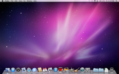
So me, being exactly what I am, decided to do a comparison of the 3 filebrowsers that I see the most, Windows Explorer, Nautilus-Elementary, and Finder, as well normal Nautilus.
First up, lets look at what all of these have in common.
Nautilus Elementary:

Windows 7:


1 - Navigation
2 - Sidebar, with bookmarks, devices, networks devices, places, and or recent files
3 - View options
4 - Preferences and option menu
5 - Search (bar or button)
6 - Current folder information
7 - Zoom slider
8 - Location Heirarchy
9 - Content of folder
So, what do we see? Well, lets compare some things. First up is navigation controls. All of the different file browsers have a back arrow and a forward arrow, and some have more. Finder keeps it just at the two, Explorer adds a little drop arrow for recent locations and a reload button in the location bar, Nautilus-Elementary doesn't have the drop arrow but does have a reload icon next to the arrows, and... then theres standard nautilus. Back, Forward, (both with drop down menus) up, stop, reload, home, and computer. Yeesh.
#2? Sidebar. Explorer and Finder both have a tree-like navigation, at least to some degree, allowing the user to hide categories they aren't using. Finder organizes into Places, Explorer uses Libraries, and both have secondary drives, as does Nautilus. However, Nautilus, as default, does not have hidden options, but instead lists the home folder, desktop, file system, network, trash, all connected drives, and all bookmarks. Not inherently that different, as all 4 show devices and places of documents, just in slightly different ways.
3 is View controls. Nautilus and Explorer share a drop-down menu listing different view options, while Nautilus-Elementary and Finder have a set of buttons, 3 and 4 respectively. Interestingly, Explorer combines the zoom slider within its view control, different from the other 3.
4: Preferences. Nautilus has preferences for it hidden within the edit menu, a few clicks from the user. At the other end of the spectrum, explorer puts a whole lot of options out in the open. However, it too hides menu items behind a keystroke. Finder has a drop button, as well as options in the global menu. Lastly, Nautilus-Elementary hides the menu behind a menu button which then unhides the menu.
5. Search. Windows Explorer and Finder both have search bars on the upper right, while Nautilus and Nautilus-Elementary both have a search button to activate a search bar over the breadcrumb trail. (Yes, the screenshot of Nautilus-Elementary from my desktop is modded with a different breadcrumb trail, thanks to Gnaag).
6. Current Folder information. This lists how many items, and how much available space is in the current folder, while when a folder or program is highlighted, it shows the content size. All 4 basically do this the same, although windows explorer goes waaaaay more in depth with the available information.
7. Nautilus has a plus and minus set of buttons, while Nautilus-Elementary and Finder have a left-right slider in the bottom right. Explorer combines the zoom with the view options drop menu.
8. Where are you at? The breadcrumb trail shows you where you are in the hierarchy of folders. In Nautilus and Nautilus-Elementary both (keep in mind that mine is slightly modded), there is a clear heirarchy visible, which, when clicked, goes to the selected folder. Windows Explorer shows this heirarchy in plain text, much like a web browser. Lastly, Finder does this in sort of a hybrid spatial view, which slides over the previous folder when a new one is opened.
9. Your content! This is basically all the same, everywhere.
So? Well, we've looked at whats the same, and whats different. Overall, I think that in terms of use and features, Finder and Explorer are the most similar of the browsers, while Nautilus-Elementary and Finder have some of the most similar visual stylings of minimalism. I think that Nautilus-Elementary and Explorer has the most balance in its design, as you can see by where all the red ink on each, and the basic clean feel of the layout, even if Explorer is (upon closer inspection) the most complex in terms of most information in sight.
My conclusion? Theres still way to much going on in all of these designs. Nautilus is straight up a joke, with overlapping and repeated functionality, information all crammed to the left margin, and overall just a lot of clutter. Explorer has far more information, yet doesn't feel anything close to as crowded or overdone, mostly because it is actually really well designed. But really, do I need an open menu at all times? just double click, right? Do I need a print and burn option at all times? Theres so many buttons that neatly blend together and sit in good balance, but are simply not necessary. Yet Nautilus seems to have learned nothing from them.
Nautilus-Elementary is really a fantastic example of a nice clean interface, with a very nice balance. Especially considering the building base of Nautilus and its mess, this design has really done much to bring a new balance previously missing from the file browser, and to clear away many of the options we simply do not need. But is it a little to much of a Finder clone?
I personally don't think so. To me, it behaves the most like Explorer, in a good way. Its looks have only one thing in common with Finder: cleanliness. The rest is simply shared heritage of file browsers, working the way file browsers ought to. I'm a huge fan of bringing file browsers back to where they ought to be on my computer: connecting me to my documents quickly, and without getting in my way.
I gathered screenshots from:
Subscribe to:
Posts (Atom)
